Final infographic design
- charlotte2006lr
- Jan 26, 2024
- 2 min read
Updated: Jan 30, 2024
After establishing what layout choice, what colours and what font I wanted to use, I began the process of creating my Infographic.
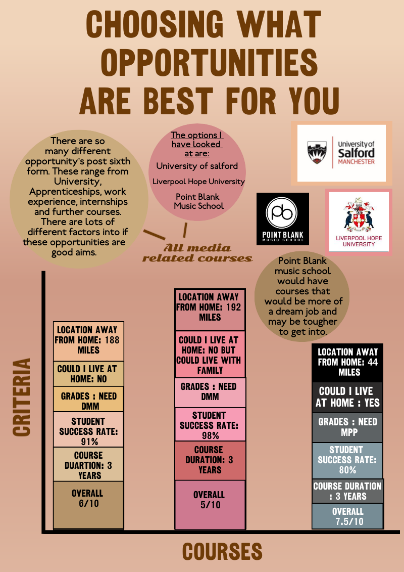
In the planning process, I was asked to create a infographic representing information on my post sixth form options and what I need to do to get there. I did a range of different things such as creating a layout and finding information. I found creating a new layout quite difficult as I was using photoshop and illustrator and had not used these software in a while and forgot where certain tools were. In class, we all worked well together by helping each other come up with ideas, talking about colours and fonts and trying to think outside the box. We also gave each other feedback to help the process develop.
My design is a bar graph which each shows three different uni's and different features of the course. This information is shown in different coloured boxes that follows the key to which uni. It was hard to maintain the standard bar chart format as I needed to fit the category's and titles into each one box. Part of making the infographic meant I needed to learn the new software. I used Piktochart which I had tested and found it the best to create infographics from scratch.
I like the way my infographic developed from the first draft layout to the finished product but there are a few things I would change. To space it out a bit better I would make the text at the top (title) smaller and move it further up. This would allow me to move the circles around and split up the uni logos further.
The most frustrating part of the task would be getting the boxes/bars to line up together and get new colours to match the theme/colour scheme. However, I enjoyed making my infographic as I was able to be creative but also look into what my future holds and what I should do to get there.
After completing my infographic and doing a self evaluation on it, I have asked my peers for more feedback on my final infographic designs.

All of the feedback comments say that they like my colour scheme. I think this could be because having the neutral/nude colours are very trendy and are used heavily in the media. I also have gained feedback on the layout. Two of my peers said that they "love" the layout and that it is easy to read and understand.
Overall, I am happy with my infographic and the way the viewer can interpret it.
Comments