Film Poster Analysis
- charlotte2006lr
- Sep 26, 2023
- 3 min read
Updated: Sep 28, 2023
Film posters feature a range of conventions that show what the film might be about. We can tell what may feature in the film or what it may be about from the poster.
Barbie

By looking at the poster for the 2023 comedy Barbie movie directed by Greta Gerwig we could infer a range of things about the movie. With the use of the bright colours such as blue and pink, the audience could infer that it will be a light hearted movie. If we are thinking about gender stereotypes, the use of pink shows that is is a very "girly" film. By looking at the characters, we could infer that they are happy/good characters as they show upbeat facial expressions and relaxed body language, their clothing is very pristine as the dress, shoes and jewelry all match perfectly, whilst his shirt, jeans and shoes all match. The font they have used for titles, dates and catchphrases is the classic Barbie font which puts it into theming. The creators have colour corrected the raw image to give it slight warmth with the pink colouring. The framing of the poster shows Barbie herself higher and and Ken lower down, with the logo of "She's everything. He's just Ken" shows an imposition of power that is held by the two characters.
Oppenheimer
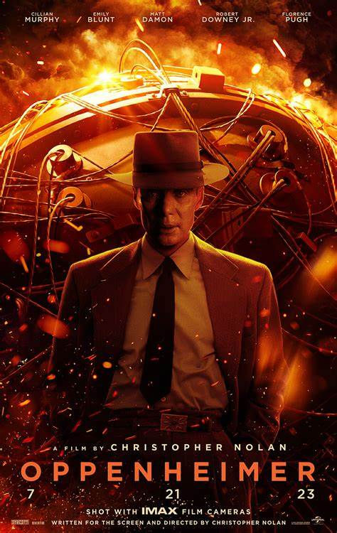
This is the poster for the 2023 Biographical Drama film Oppenheimer directed by Christopher Nolan. The poster suggests to the reader how the story might be, for example the poster features very dark lighting and colorways, showing shades of black, red, brown and orange. These colours can represent badness, fire, heat, time and history. In opposition to Barbie, where the two characters facial expressions where light and happy, Oppenheimers facial expression is very serious and stern, when put with the colourings and facial expression, the audience learns that this film is not going to be fun and light hearted like Barbie. By looking at body language we can see that he may be following an issue and has something going on as his hands are in his pockets and the angle of the image is taken as he is looking forward towards the camera as a headshot, a headshot has been used to show emotion and tension. By using the font Gotham Bold font the viewing can once again infer that it is a very serious movie as it is very different to Barbie as barbie has light and swirly writing. By looking at the placement of Oppenheimer, he is centred in the middle of the poster, telling the viewer that he is the centre of the story.
28 Days later
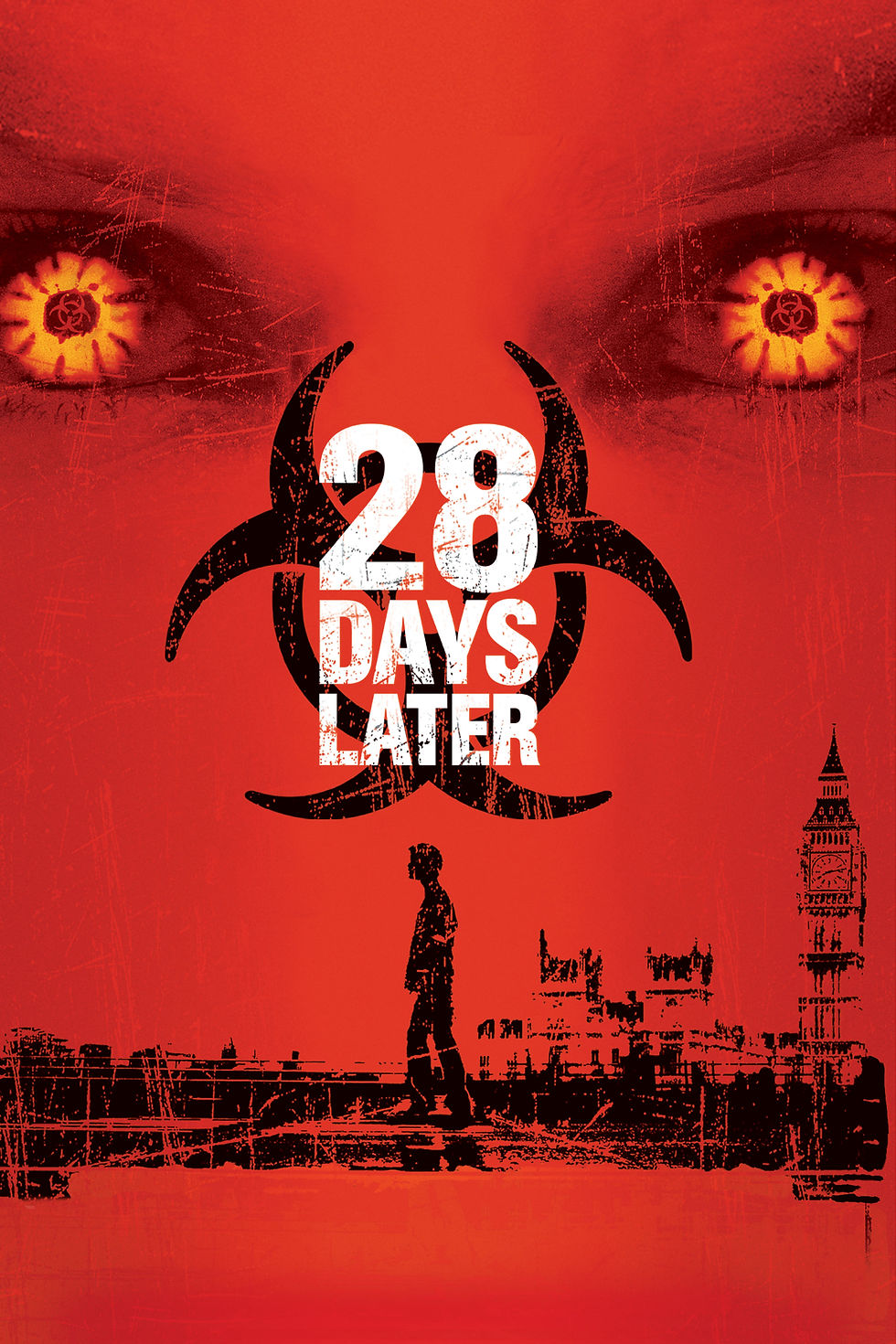
In 2002, Danny Boyle directed the post-apocalyptic horror 28 Days Later. By looking at the poster we can infer many things. The poster is mainly red and black, with features of orange and white. The eyes that feature at the top of the poster is an extreme close up and seems quite sinister and when paired with the colourings, the viewer gets the impression that this is not a light-hearted comedy film and that it will have some form of evil in it. Looking at the foreground of the poster we can tell the film will be set in or will take place around London, we can find that out by looking at the landmarks depicted in the background; Big Ben and Tower Bridge. There is also a man centered in the middle of the poster. As he is centered and alone, like Oppenheimer, we could guess that he is the main character in the movie or who we will be following the story of. We are unclear of age, facial and body language due to it only being a silhouette of a figure. Looking at the words, the font used is grainy and gappy pottentially inferring that something is wrong as it is not pristine and perfect as it could be.
Comments