Infographics design and layout
- charlotte2006lr
- Jan 21, 2024
- 2 min read
Updated: Jan 24, 2024
When creating infographics we can experiment with colours, layouts and images. Moving forward with my infographics I will be later filling them in with deciding what uni courses would be beneficial to me.
Design 1
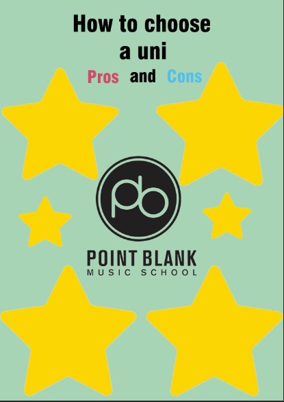
I started off with my first design. I created this on photoshop. The main features are the title, the university logo and some shapes. I had planned on structuring it like a mind map and having the information within each star.
Design 2
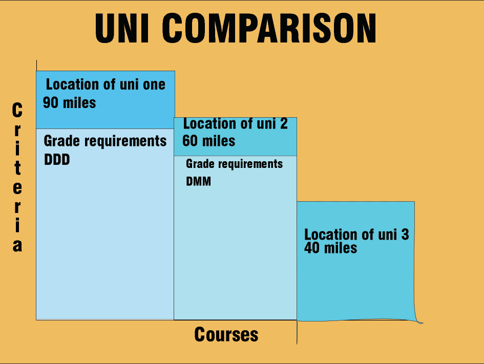
Design 2 was created from an x and y axis labelled "criteria" and "courses". The graph then featured a bar graph structure and the height of the bar corresponds with information like the location, grades needed, course duration, tuition fees ect.
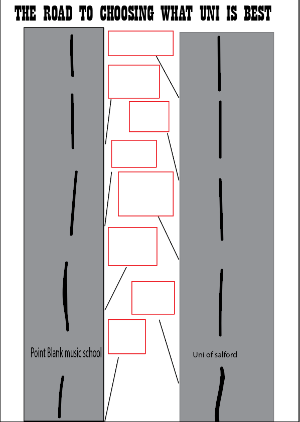
Design 3
Design 3 shows 2 roads both being a different uni and along the middle are different road signs. The plan is to fill the road signs with the information on the different facts and features.
Going forward with my results, I needed feedback from others to tell me what they think about my designs and if there was anything that could be changed.
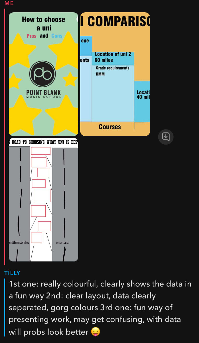


I think that overall looking at my feedback the best infographic is design 2 which the general feedback was that is was straight forward and clear to read. There are quite mixed feedback with each designs for example, in Tilly's feedback she said that she liked design 1 as it was colourful and clear, Bella said that she likes the stars and how they attracted people towards the design, however Zoe said that the colours clashed and were quite messy.
Making these layouts, I found the process quite difficult as I had not used photoshop or illustraighter in quite a while so forgot how to do it. I also struggled with finding how to present the information I had gathered as it was all in different values (grades being pass/merit/distinction and location being in numbers). The best way I find to present this was in a bar chart and each colour represents something else.
In my personal opinion, I prefer design 2 out of three as I think that it is clear, straight to the point and the best layout. Whilst 2/3 feedback responses say that they liked design 1, I agree with the other feedback which says they do not find design 1 the most visually appealing. I could take design 2 forward to make it even more visually pleasing to the viewer. I could do this by adding images or pictures, using a more interesting font and a wider range of colours.
Comments