What makes a good graphic design?
- charlotte2006lr
- Jan 9, 2024
- 6 min read
Updated: Jan 11, 2024
Many things go into making a good graphic design, I will be looking at examples of infographics which is essentially how information is presented by the use of graphics and how they have been made to be visually pleasing.
Example 1
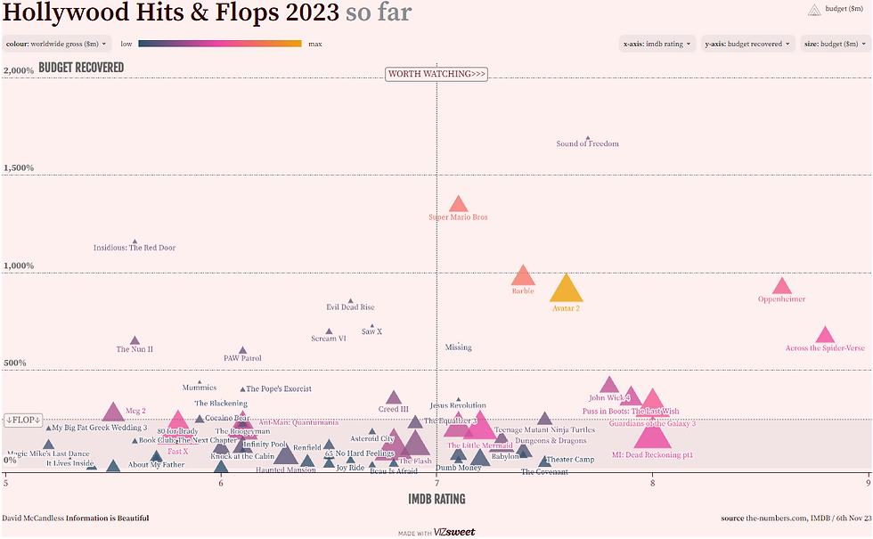
The first example I found shows how Hollywood films of 2023 differed in success. This is rated on how much of the budget the movie gained back once it has been sold, distributed and released. The layout shows each film represented by a triangle with the title of the movie. I think it is good that you can hover over the triangle and it will tell you all the information about the movie. The use of triangles isn't very aesthetically pleasing and could be changed to be better, for example maybe turning them into circles with the film poster in as this will make it slightly clearer and maybe more interesting. Another idea for the layout could be that they just put the title of the film in a circle so its visible to the viewer. The last thing I would change about the structure would be how the graph/diagram is laid out. Instead of the IMDB rating, have it based on which month of the year the film came out. and also space the movies out so that they aren't overlapping - making it easier to read.
Times new Roman is the font used on the graph. Times new roman is a very standard font and is used in common articles, posters and graphs. I think that the use of using times new roman in the graph is good however again paired with the structure of where the triangles lie, it does make it more difficult to read. This could be changed by spacing each movie out so they don't overlap and it will become easier to use.
The triangles follow similar colour schemes by being pink, blue, purple, grey, yellow and orange. These correspond in the amount of worldwide gross profit the film made. I think this is a good way of being able to tell this however I would change the triangles to either being the same size or just turning them to something completely different. This is because I find it quite difficult to visually read and if i do I'm sure many others do as well.
In conclusion, I don't think this info graphic is a great example as it is not very clear and is very messy. Viewers may not understand what it is trying to show and represent and will be disregarded as it is not very clear.
Example 2
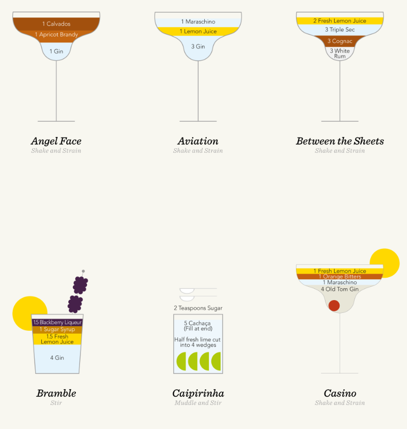
The second example shows drawings of cocktails and the measurement's of each ingredient fill up the glass that they are served in. I like this graphic design as I find it very visually pleasing.
Looking at the layout of the page they are sectioned extremely well, the glasses are not too close together nor far apart as well as this they are equally sectioned out. I also find that the layers of ingredients being different colours with different colours for the text works brilliantly as for people who may struggle to read or see it is made slightly easier as well as adding a good visual finish. I also like the drawings of the fruit as they are minimalist but nice looking. Overall the layout of the specific cocktails is very visually pleasing.
Next we can look at the font. There are two main fonts used on the poster. One is more decorative and the other is more formal, this is because one wants to attract viewers to want to know more (this is the one which lies on the bottom of the cocktail explaining what it is) and the other is to explain to the viewer what the cocktail is composed of (the formal one shows the ingredients to make the viewer understand what goes into it), this is to inform. I like the contrast as it works well and is kept continuously throughout the poster.
Finally, looking at the colours that have been used we can tell that they have tried to keep it quite simple whilst also being formal. Had they have used loads of different colours it would be more messy and chaotic to look at. But the creators have not, this makes it more visually pleasing. The have used similar colours throughout the poster to keep it continuous, using shades of yellow, light blue, orange especially where the ingredients are the same.
In conclusion, I believe that this is an excellent representation of a infographic as it shows clear examples, telling clear information through the use of graphics whilst also looking visually pleasing to the viewer.
Example 3
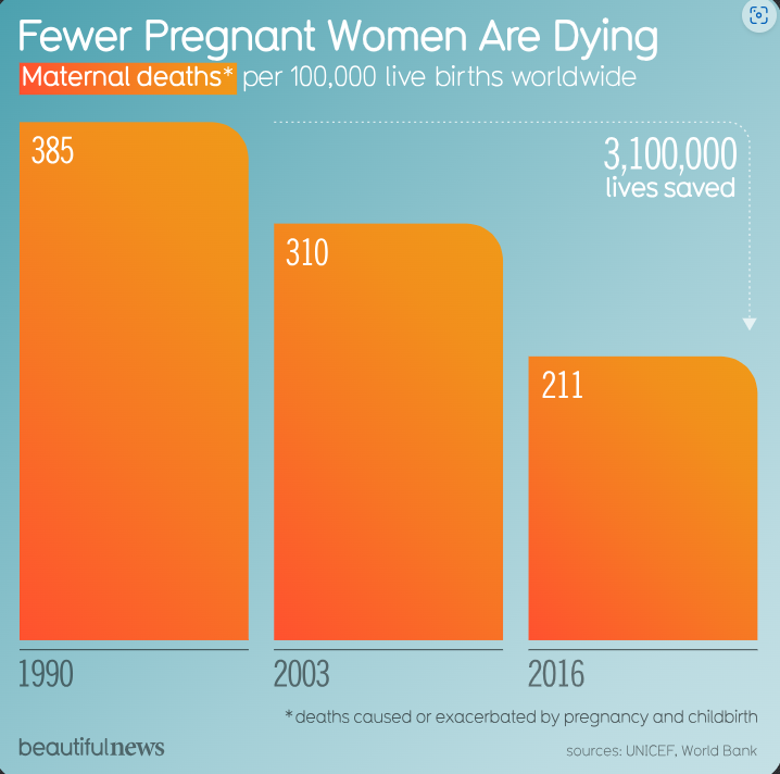
This infographic shows how the figures of deaths during pregnancy and childbirth from 1990 - 2016 has decreased.
The layout of this infographic is clear and simple to understand. Its main features are the fact its a bar graph that on the X axis shows year and the instead of using the Y axis to show the amount of deaths they simply put the number in the top of the box. I think generally for most views I believe this is a good way to get the basic numbers out as it saves people from looking at the graph to find out or even calculating a key if its not easy to show. The bars are spaced out 0.5cm apart, making them equal. This is beneficial as it is more pleasing when looked at, instead of being "messy". The text is resized and again is spaced out clearly. We can see that the titles is larger and bolder than the rest of the font, making it clear that this infographic shows that "Fewer Pregnant Women Are Dying". Other information includes that the information is based on maternal deaths per 100,000 deaths. This is put up higher on the poster so that its one of the first things you read and that the context is given. I think that the lay out is simple yet effective for the viewer, if it featured too much information people would not be interested as the point may not be made clear straight away, whereas this is what this graphic does well.
Looking at the font choice used they have kept it the same throughout the graphic. This is good as it shows continuity and also keeps the infographic clear and simple. The font choice is not too in your face yet also not too basic that it does not grab you. This is good as it is kept simple for the viewer. I think that they could have used similar sizes throughout as with some things it is smaller than others and becomes slightly harder to read.
Finally, colour is used in this infographic to keep it interesting and relevant. They use a gradient orange - fading from light orange to dark orange. This makes it more visually pleasing to the viewer and keeps interest. Orange is a warm colour and has been paired with a blue background. Blue is a cold colour and being paired with a warm colour can create a sense of drama, contrast and balance to the viewer. For example, had the orange foreground be paired with a red background it may be too dark and may add a different feeling to the viewer. They also use either white or grey font colour. This is used depending on either what the information is or what colour the font is being put onto.
In conclusion, I believe that this infographic is a good one as it get the data, the facts and the information across clearly and priestly.
Based on all three examples we can see how different they are all structured and what this means to the viewer. For example, the font used on example 1 and 3 are both used more functionally than example 2, this is because example 2 is very minimalist and it does not tell a large amount of information.
Looking at all three examples of infographics, I would say that the best one is example 2 as it is extremely simple but in a visually pleasing way to the viewer. Comparing this to example 1 which had almost too much information that it took some time to look at and understand and was also laid out rather messy and example 3 which was also fine but was not as visually pleasing. I think all three have details that could be changed such as spacing (example 1), slightly more information (example 2) and font size (example 3) but all show a good range of how information is shown in infographics.
Comments